.jpg?width=50&name=DSC_0028%20(1).jpg)
←Back to resources Welcome to a new series here at NewsRx - BUTTER tips and tricks! Are you making...
←Back to resources
Welcome back to BUTTER tips and tricks! Previously we shared posts on how to get the research you need, when you need it and on how to use BUTTER’s clinical trials tool.
The dashboard is your home to using BUTTER and making the most of it. So today we’ll be exploring how to optimize your dashboard to make BUTTER work for you and your research.
Understanding the Dashboard Layout
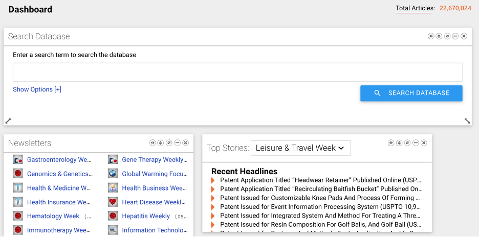
Without any customization, the dashboard begins with BUTTER’s major features gathered into one scrollable page.
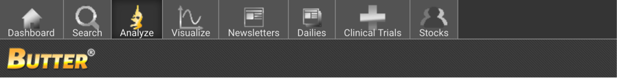
At the top is the ‘Search’ function, which can be used to search BUTTER’s database of peer-reviewed research articles, patent research news, preprint articles, clinical trials, and more.
Next, the ‘My Top Stories’ widget displays major headlines from your area of interest. All you need to do is type in a keyword or keywords about your research area, and the widget will populate with the latest articles that match your keyword. For example, we’ve highlighted top stories for blood cancer by simply typing ‘blood cancer’ into the search box.
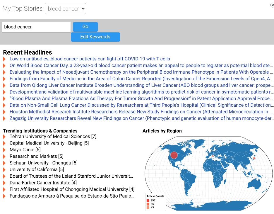
Below the recent headlines in your topic of interest, the widget displays trending institutions, regions, and subtopics to give you a greater understanding of trends in your chosen field. Once you type in your keyword of choice, BUTTER will automatically save the keyword so that you retain the blood cancer news in your dashboard even when you navigate to other pages.
Next up is the ‘Saved Articles,’ which will store your starred NewsRx articles. Once you press the star next to a NewsRx article, the article will automatically appear in this section of your dashboard.
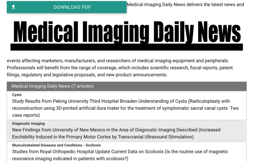
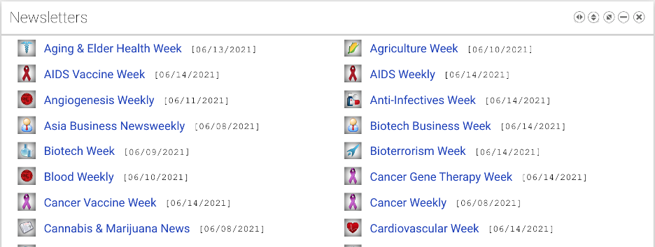
There are two widgets for newsletter subscribers: the Top Stories widget and the NewsRx Newsletters widget. If you have a full-access account, these will display a list of NewsRx’s 200+ newsletters as well as notable headlines and trends. If you’re only subscribed to certain newsletters, only articles from the subscribed newsletters will appear in these widgets. For newsletter subscribers, these widgets provide quick and easy access to a user’s relevant subscriptions.
Additionally, the dashboard displays lists of your saved alerts (see tip 3 of Butter Tips and Tricks Edition 1 to learn how to create an alert), searches and analyzations. And last but not least, there is the New Discovery Index, an overview of total global research discoveries for the last six quarters.
Customizing Your Dashboard
Even as you scroll through the dashboard in its basic settings, you can adjust it to fit your needs.

For example, look at the buttons on the right side of the "Search Database" widget. They can be used to customize your dashboard.
The arrows on the far left and second to left can be used to expand a widget of the dashboard horizontally and vertically. These are for highlighting or sidelining individual widgets of your preference.
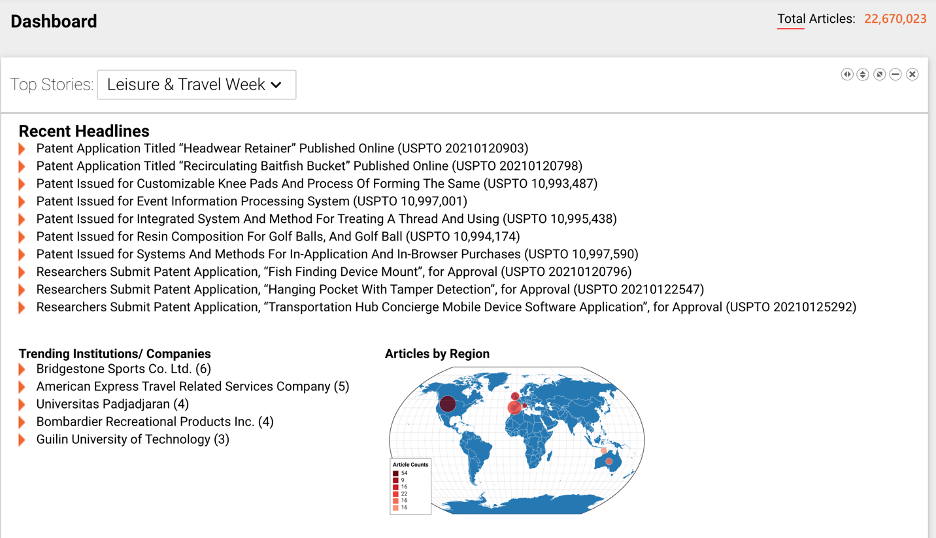
For example, if you frequently use a specific NewsRx newsletter, set the Top Stories widget to your preferred newsletter, expand the widget vertically and horizontally, and then click and drag the entire box to the top of your screen so it displays first. In the screenshots below, we used the Leisure and Travel Week newsletter.
Dashboard before rearranging:
Click buttons on far left and second-to-left of the Top Stories widget, then mouse to drag widget to the top of the Dashboard.. Here is the dashboard rearranged to highlight Leisure and Travel Week newsletter:
You can also use the ‘minimize’ button to shrink down less frequently used widgets or the ‘close’ button to remove unused ones altogether.
Dashboard Options
But the most powerful part of the dashboard lies in the little ‘Options’ square floating on the left side of your screen.
When you click it, it pulls the following screen up:
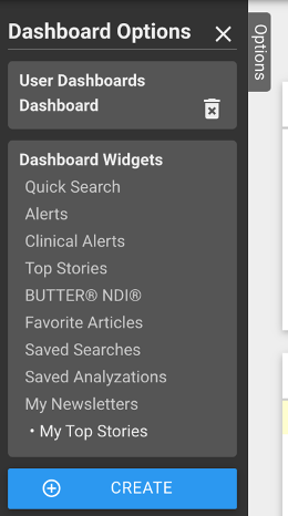
This displays your current dashboard’s widgets. However—you can have multiple dashboards! Just create a new one and then use the options tab to switch between your two dashboards:
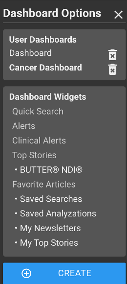
Using multiple dashboards is a great way to divide and conquer your work. For example, you can keep a generic dashboard that includes news outside of your area of specialty, and then make a second dashboard to hone in on your area of expertise.
You can tailor your second dashboard more aggressively, paring it down to the bare bones widgets that you need in your research. Then, when you’re looking for more general research news at the start or end of your day, simply switch back to your general dashboard.
The Dashboard is a powerful but overlooked tool for staying organized and displaying the research that matters most to you from the very second you open BUTTER.
Use multiple dashboards to keep your research organized. Rearrange the widgets on your dashboard to highlight searches, newsletters, or alerts depending on which features you use the most.
Above all, make full use of dashboard customization to create dashboards that are aesthetically pleasing, that keep you organized, and that allow you to do research efficiently and intelligently.
